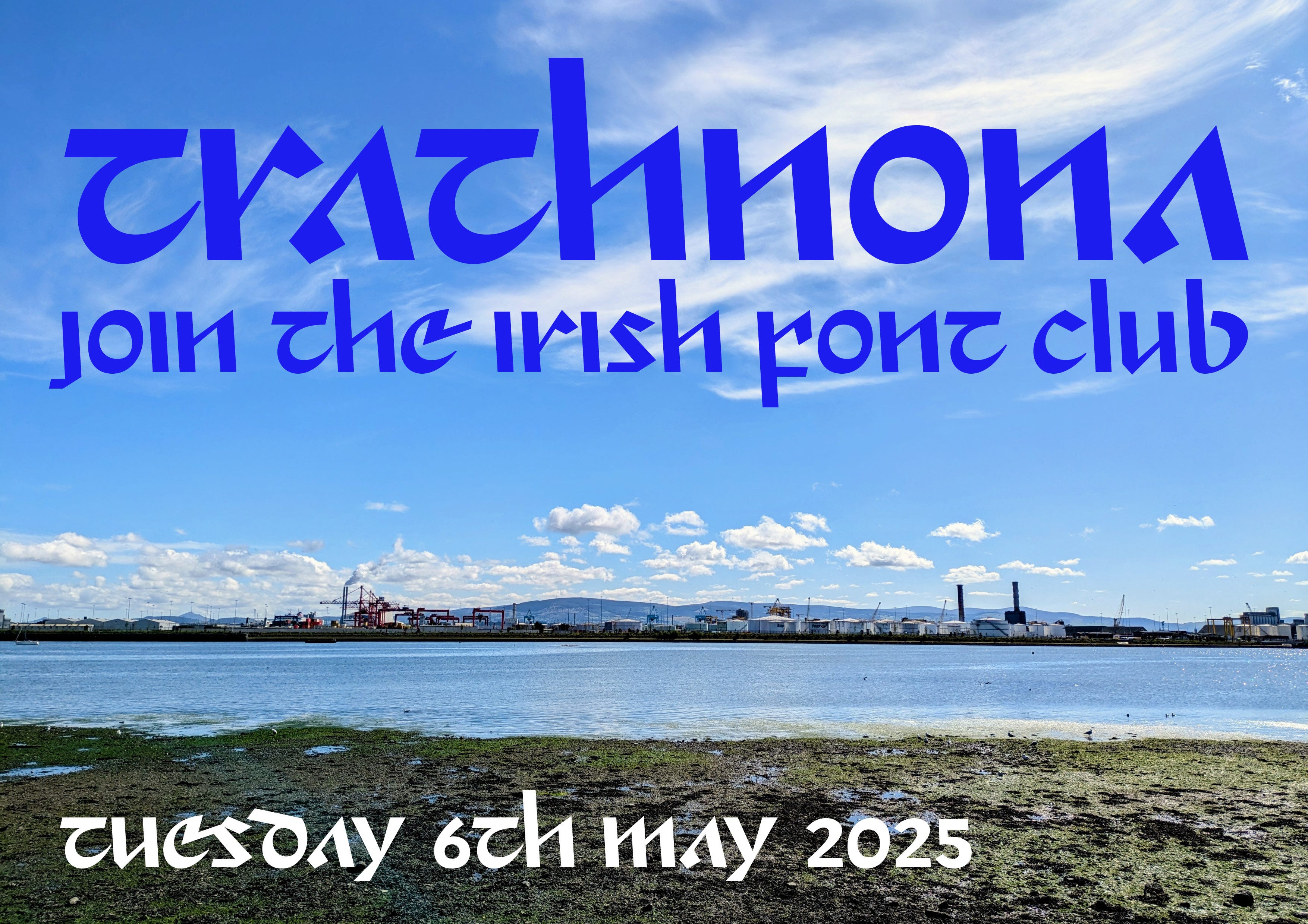
Irish Font Club Newsletter #5 Afternoon Origins
Trathnona font design choices and sources of inspiration

As promised, here’s a breakdown of some of the design decisions of the Trathnona font… as well as I can identify and articulate them in any case. Download the font for free here: https://github.com/insert-smiley/Irishfontclub-trathnona
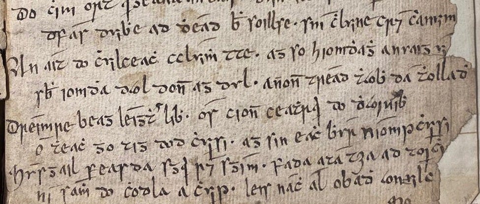
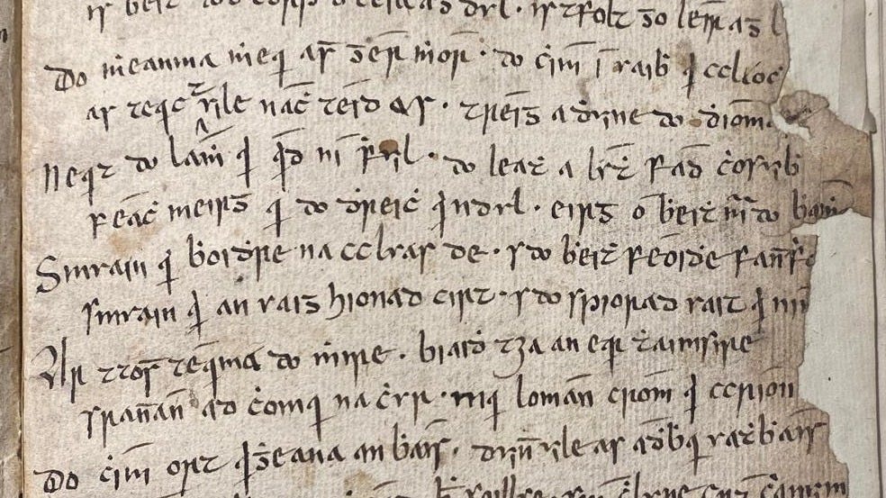
The original source of inspiration came from the writing of scribe Fr Seán O Briain, writing in 1738 (See below). Pádraig Breatnach drew my attention to the script. I love the clarity and consistency of the writing.
So that’s the starting point, and although its almost 300 years old, its fresh to our eyes and unfamiliar in terms of Irish font design. I tried to imagine what Irish type would look like if this was the original source of our printed letterforms today.
An infinite variety of fonts could be drawn based on the above sample. I chose one direction which might hopefully be as attention-grabbing as the original. To my mind, Irish fonts often mimic ye olde calligraphy too closely. There’s nothing wrong with it but a modern calligrapher could do a better job of recreating the source than a digital font ever could. We’re not looking for recreation, we’re looking for inspiration. Font design should face forward. A font uses elements of calligraphy to make one-size-fits-all models of each character that will work together with every other character in any combination.
Fonts are designed for sentences as yet unuttered.
It must be said, Trathnona was probably influenced indirectly by Roger Excoffon of Fonderie Olive (Choc, Mistral, Banco). I wanted to imagine a typeface as if Irish characters had continued to evolve in the way other Latin letterforms did (I will refer to these as Latin for this article).

The Latin alphabet has evolved even in the printing era but the Irish script remains frozen in the 18th century. If it was in use in France in the 1960s, perhaps Trathnona is what Fonderie Olive may have produced.
In terms of design decisions, I used the weight and the contrast of the original source but made changes to the skeleton. I kept it lower case only, with an angle. The original calligraphy made use of at least three different angles, depending on the letter combinations. This proved too complicated for the typeface. I chose one angle for consistency. I took out the curves. A personal decision but I wanted an angry energy in the font. Its sharp and a bit gothic, nothing twee in the Irish Font Club.
I made mistakes and I kept them. I used the sample below as a reference but I misread “an uaig” and designed “an raig”. The old “u” is now an “r” and it works like that.

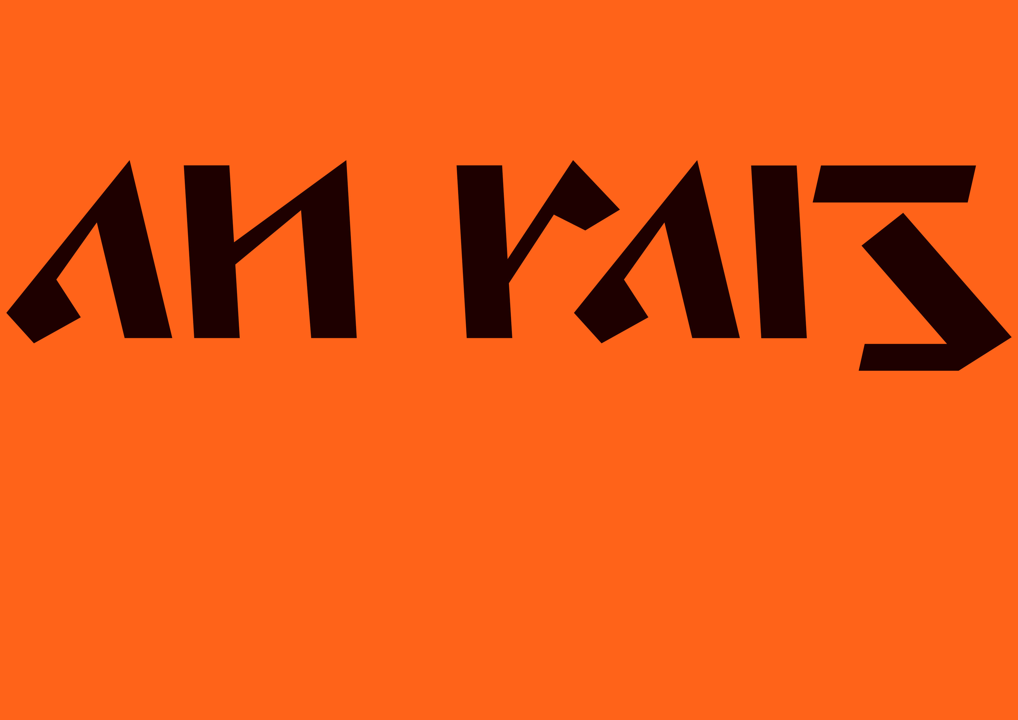
The original “a” is there, an open triangle, as is the “e” but they’ve both been fed through a buzz saw. The “e” links with each subsequent letter. The in and out serif-strokes of most of the letterforms are gone, but I’ve treated many of the letters as if they were Latin lowercase sans “p’s” or “n’s”. The join on the “t” is to the right. I used the “b”- fully rounded and leaning to left as a guide for the whole thing. The “g” is delightfully disconnected… And the rest, dear reader, I made fit. Download Trathnona for free here: https://github.com/insert-smiley/Irishfontclub-trathnona. Its new and it stands out.
D.