
Comharta font Origins
On local street signs

Irish local street signs are unique. Where one may think that a signage system should be consistent in its presentation, in Ireland it can be difficult to find two signs that follow the same typographic rules.
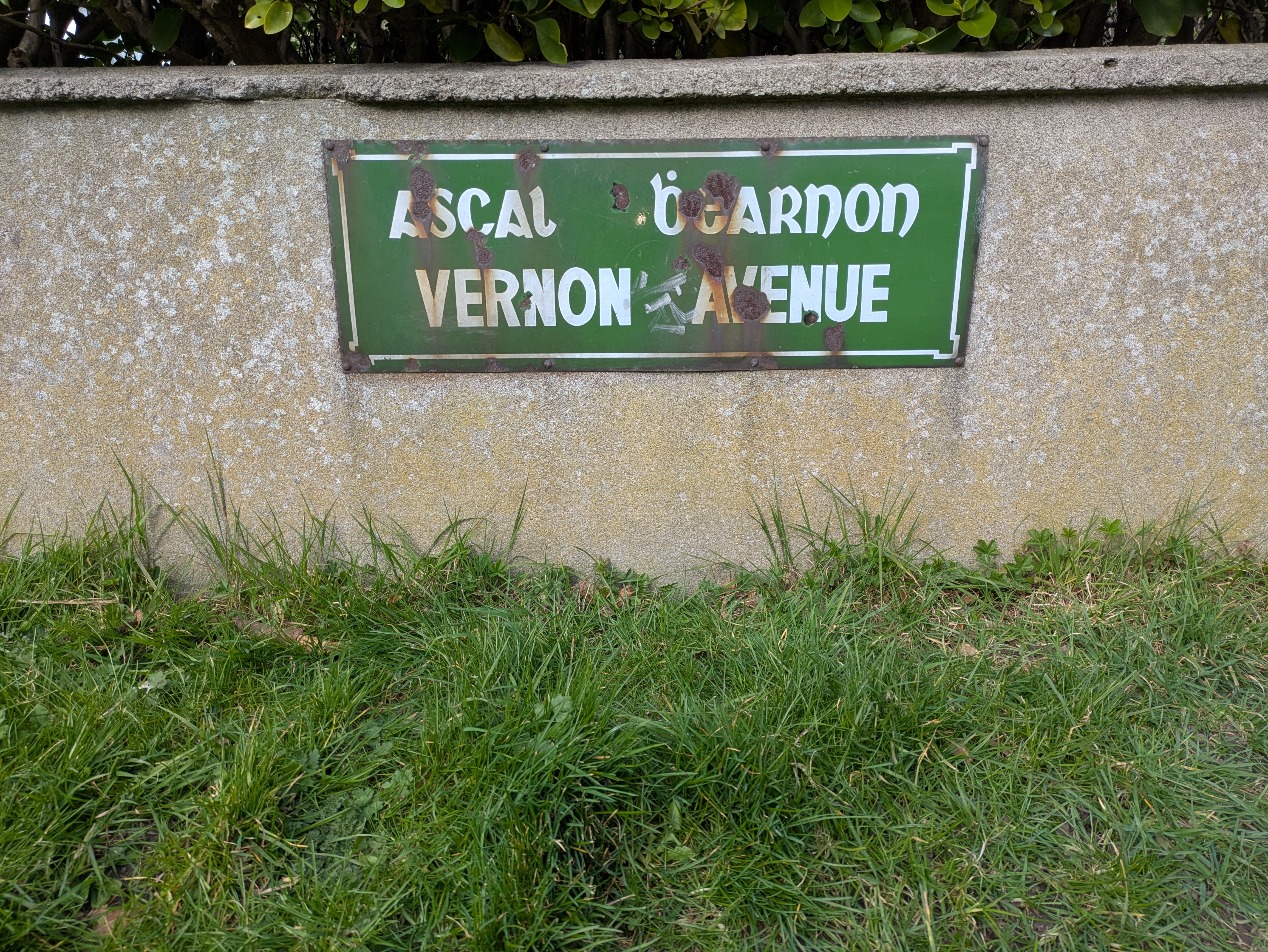
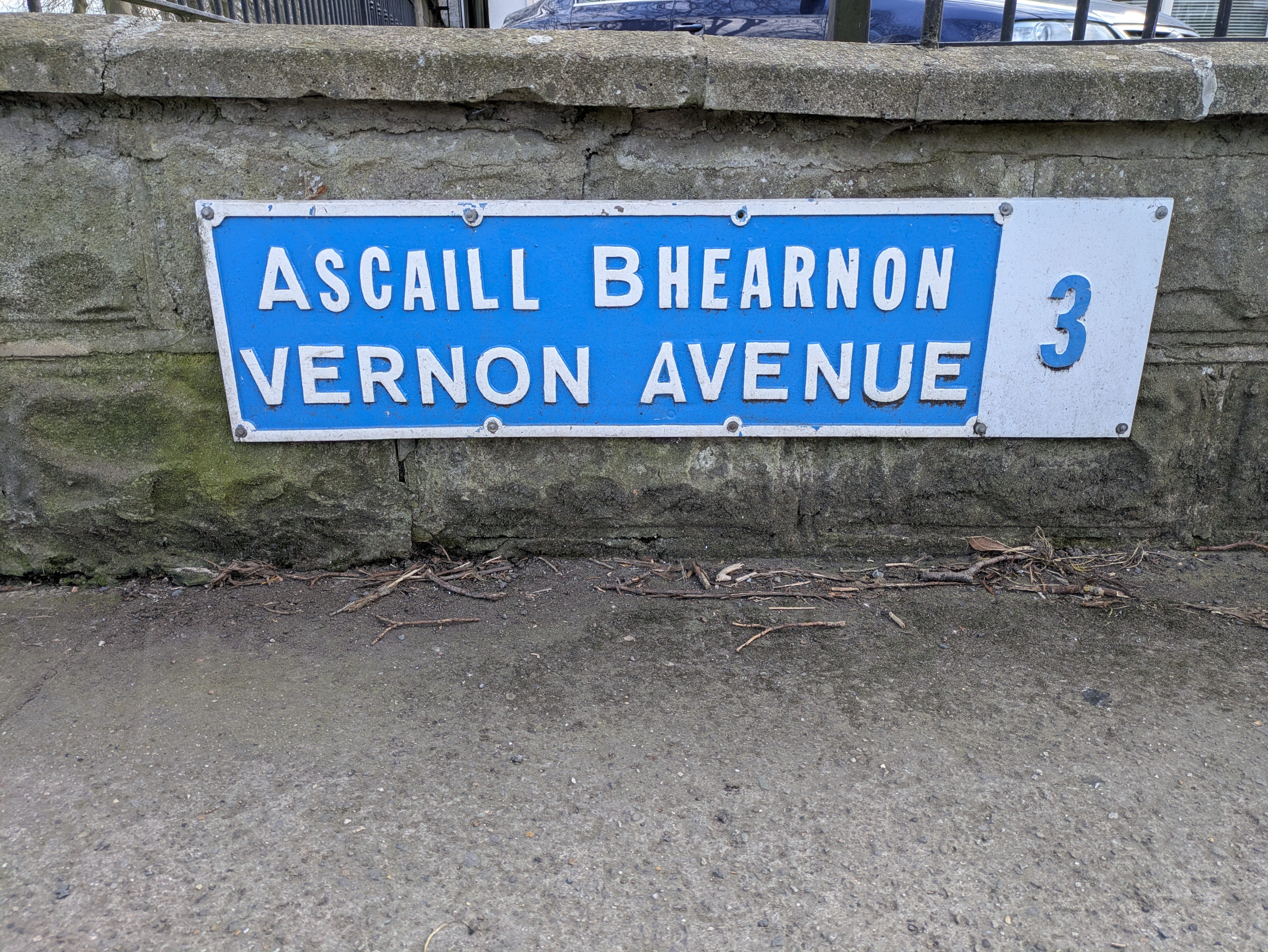
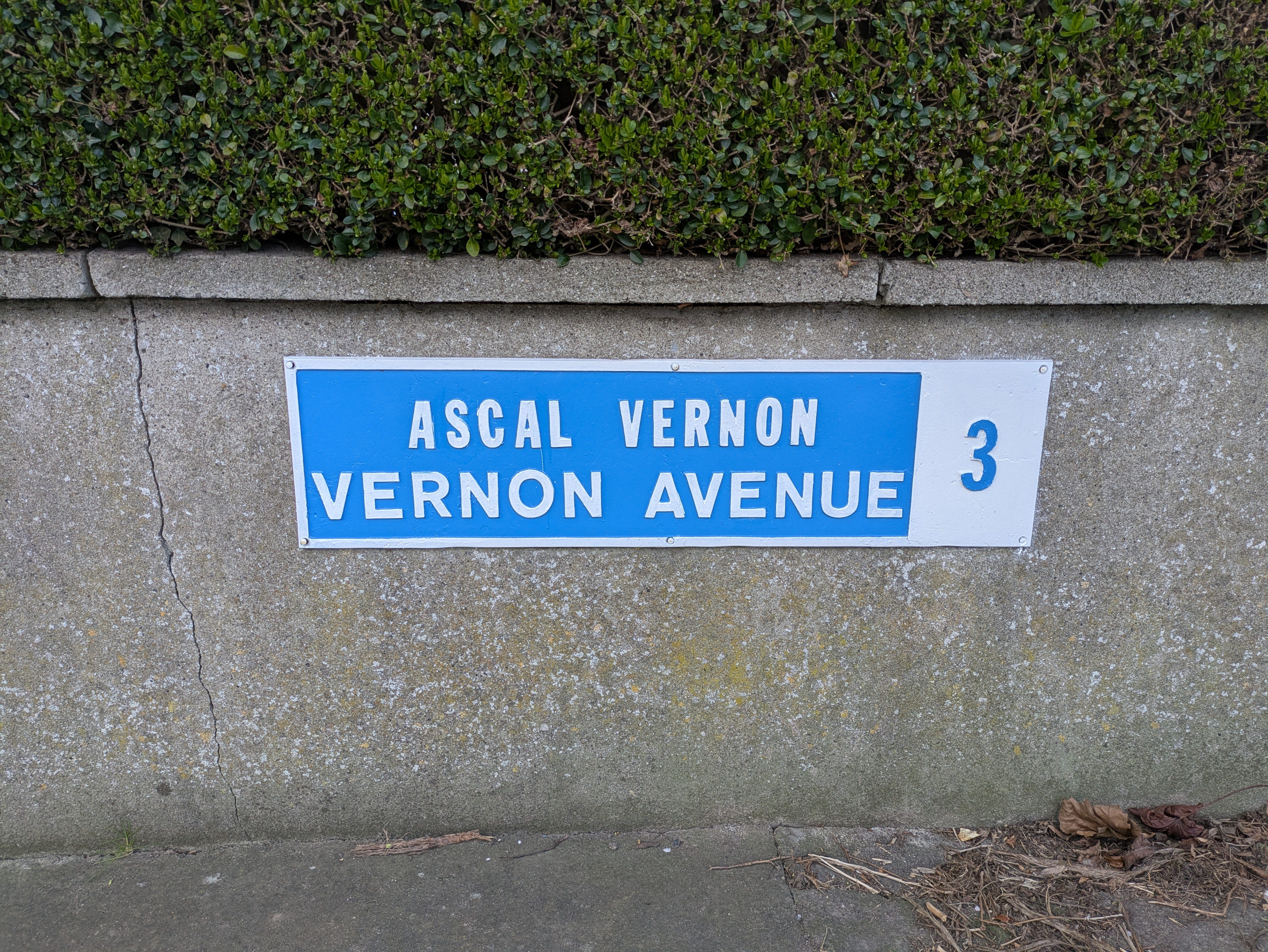
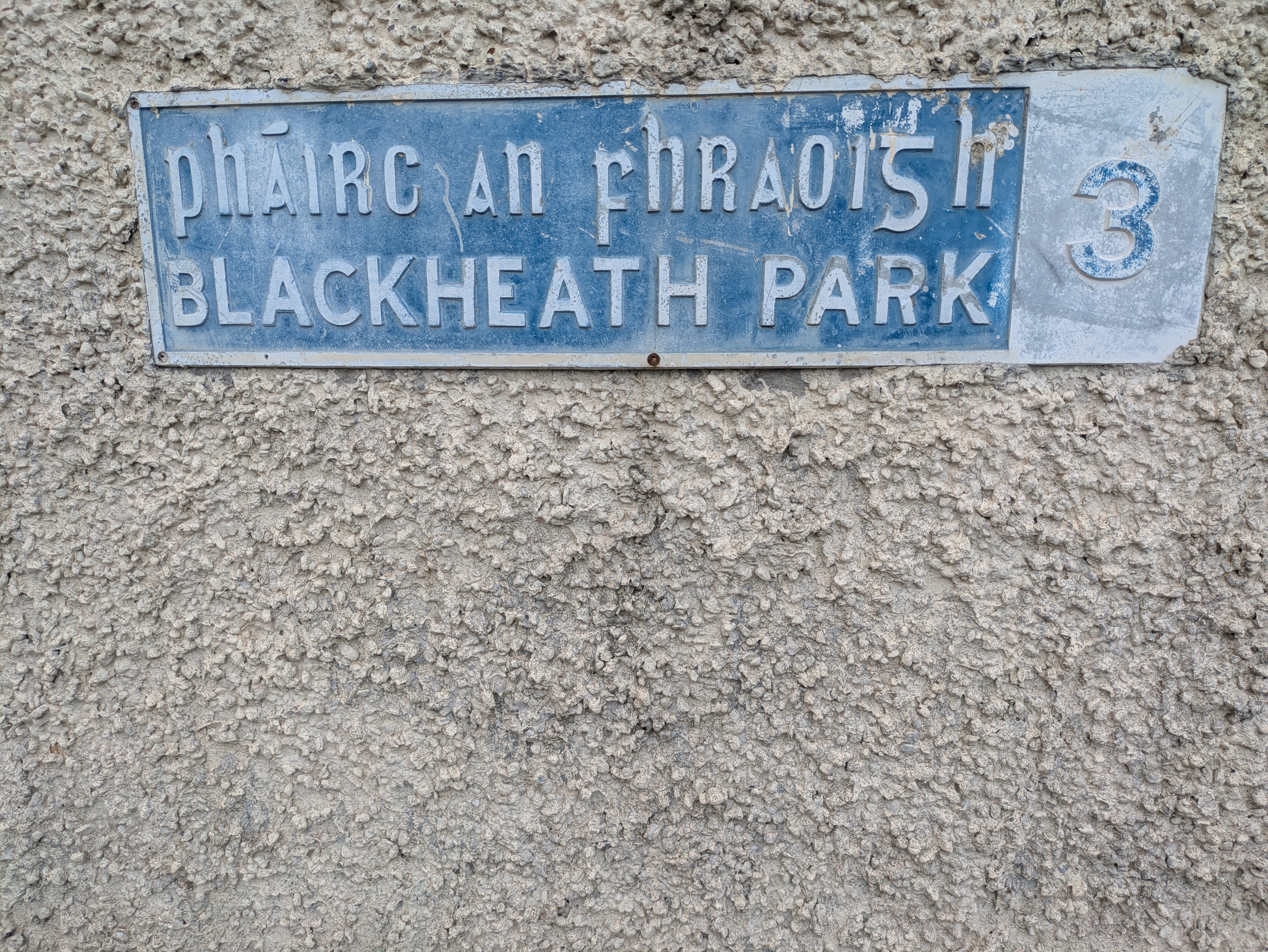
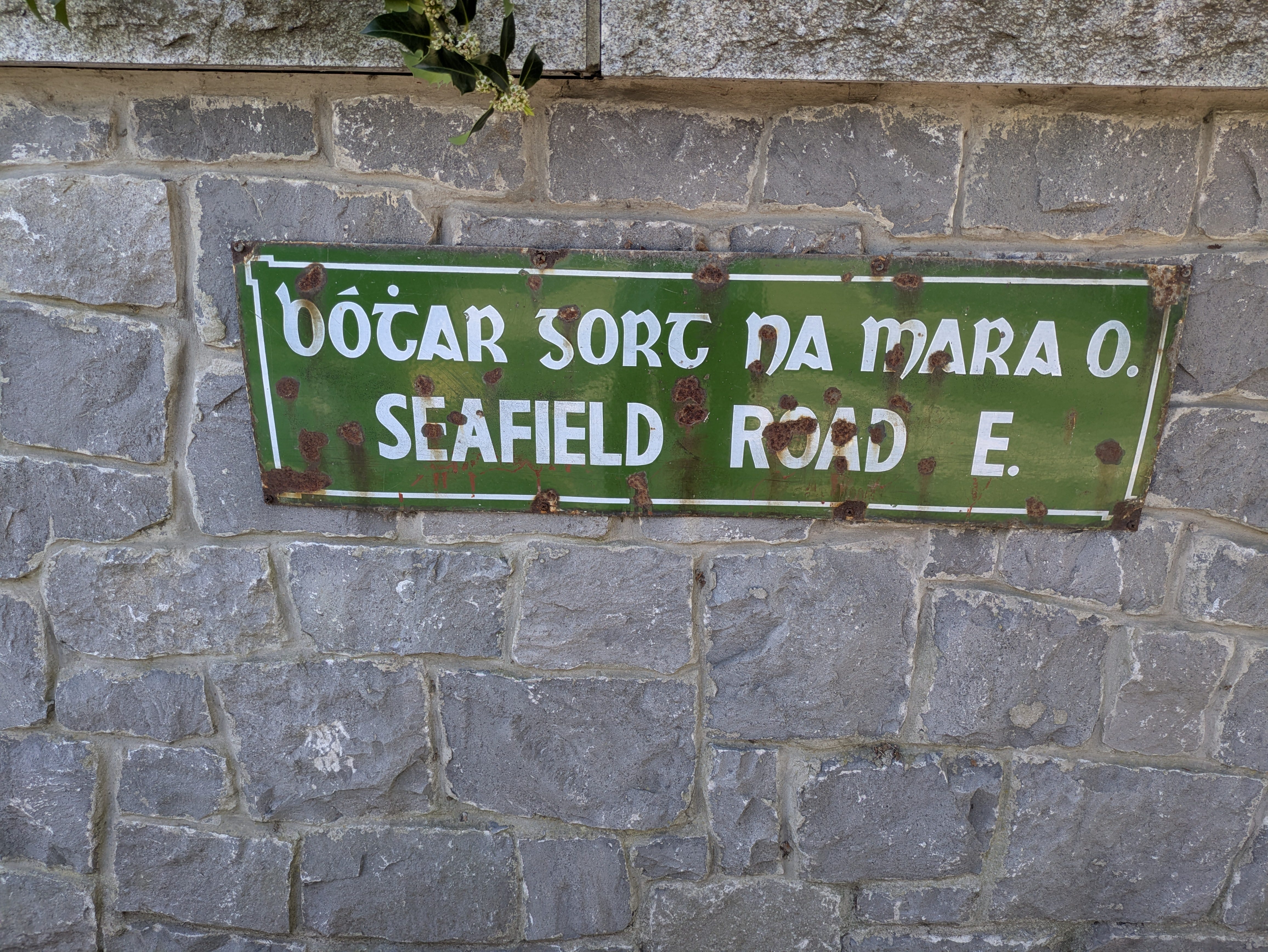
For example see the following three signs for the same road in Clontarf.
Spot the difference? A few things jump out for me. The green signs are the older ones and they usually feature printed fonts in different parts of Dublin. There's a study going on in Trinity college at the moment to collect different examples of the green signs in order to archive the old fonts in use. For me, most of the printed Irish fonts don't work for signage as they are not easy to read from a distance.
Trinity college street sign study
The Clontarf green signs don't use printed fonts however. They use hand painted enamel letters instead. Here I think the top sign works better than the other two that because of how it differentiates the two languages but doesn't minimise either. Irish is written on top in an italic half-uncial and English is written in upright capitals. They each look unique and share equal billing. I'm not mad about how the words are centered with a massive gap in the middle but that seems to be consistent in all of the signs. For the record, the word Vernon doesn't have an Irish translation so Bhearnon isn't more correct than Vernon but I find it funny that each sign chose a different way to write the same word. I also appreciate the old seimhiu (dot diacritic) on the b. All the A's on the green signs are painted backwards- with the thick line on the left side which shouldn't work, but does.
The second picture uses regular width Capitals for just the first letters of the Irish words. The rest of the letters are condensed. I see this quite often and I have no idea why. The third sign is relatively uneventful which makes me long for the eccentricities of the others!
Next up we have three more signs from the same area so you can see more mad typographic choices:
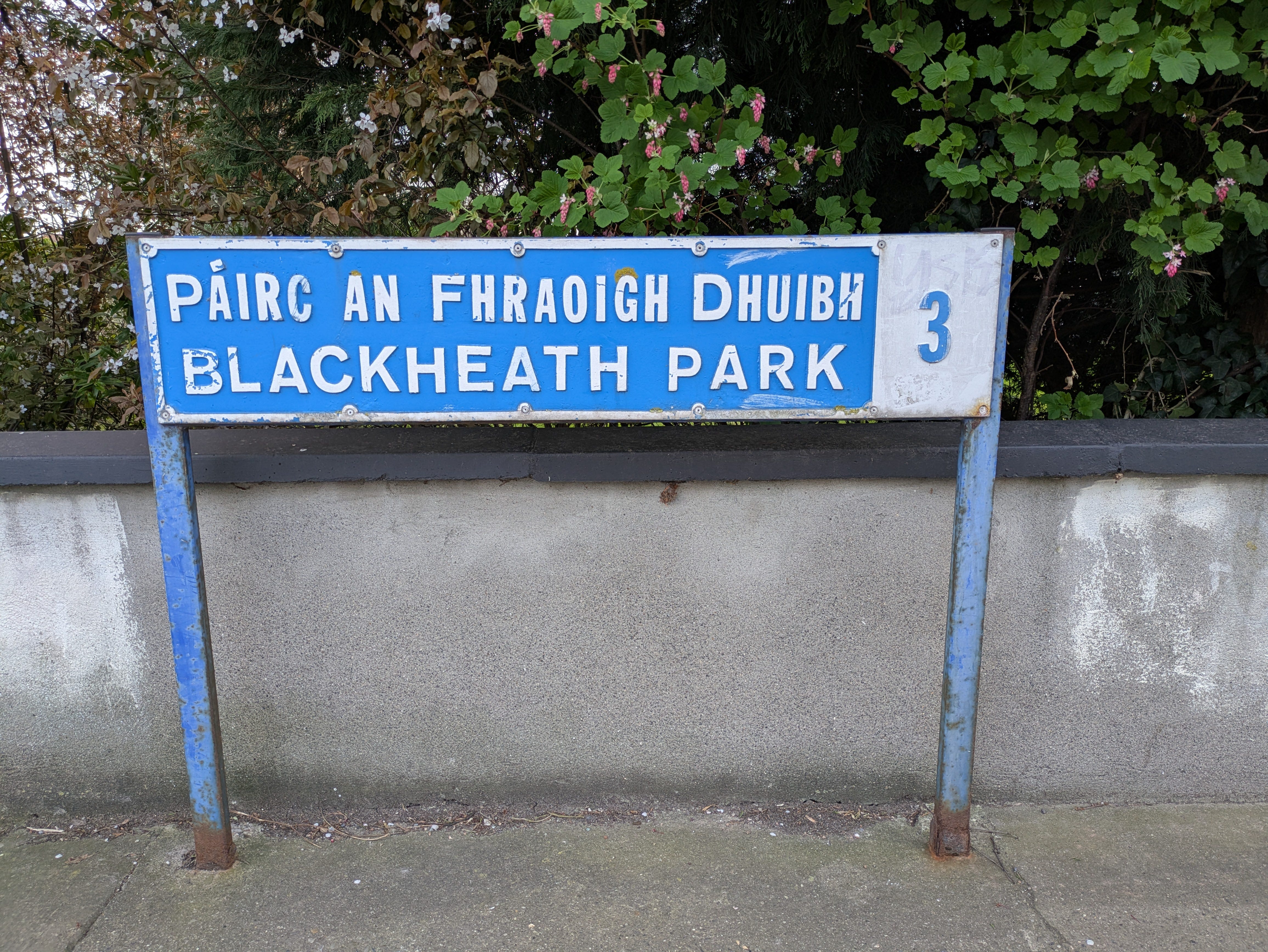
The top two are of the same road. One possible explanation for using a condensed font for Irish is to save space if the translation is long. Here they have dropped the Irish word for Black in the second sign while also adding loads of space between the letters. Who knows why? I'm not a fluent speaker but I'm pretty both signs mean different things in Irish. The font used on the middle sign isn't great. The A doesn't reach high enough, the fada (acute diacritic) is too flat and not aligned correctly and the g is from a different font.
I hope you'd agree that the old green hand painted signs do the most justice to the Irish letters even with the wear and tear, graffiti and twisted A's. I think English and Irish looks best when written together in this way.
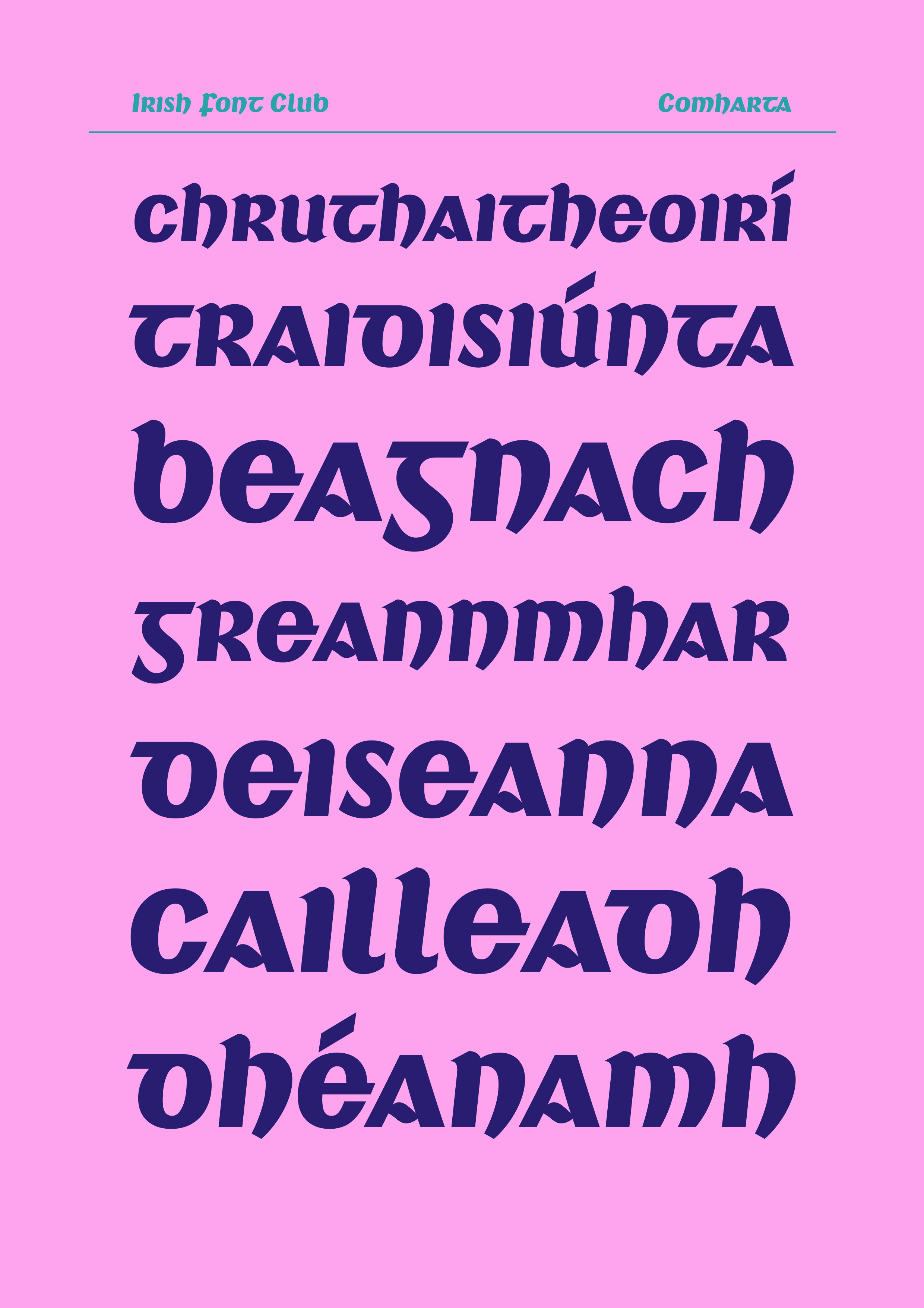
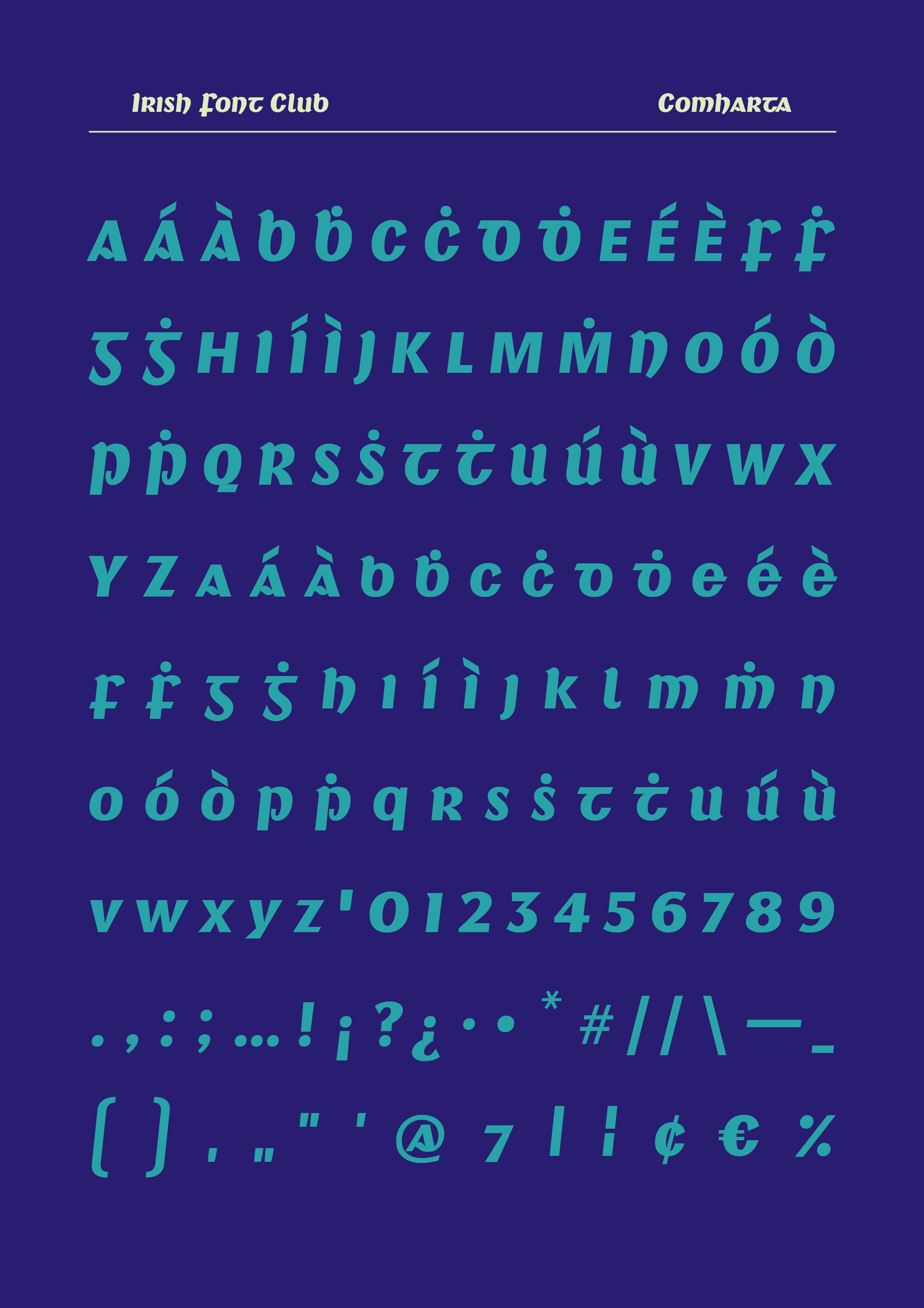
These green signs were my inspiration for Comharta. I flipped the A's around, made use of some more standard latin characters for the caps as some of the half uncials lost something when used as capitals (m for example). There's only a slight angle on the letters so they work as a regular font and don't have to be used as secondary italics. So far, I think Comharta is the best of the three fonts released on Irish Font Club which means I’m heading in the right direction at least. Best used for headlines and street signs of course. Give it a go and let me know what you think!
GRMA
Dominic
PS: I updated my Stanley fonts website. Please check out my work here: Stanley fonts