


Irish Font Club newsletter #2
Origins

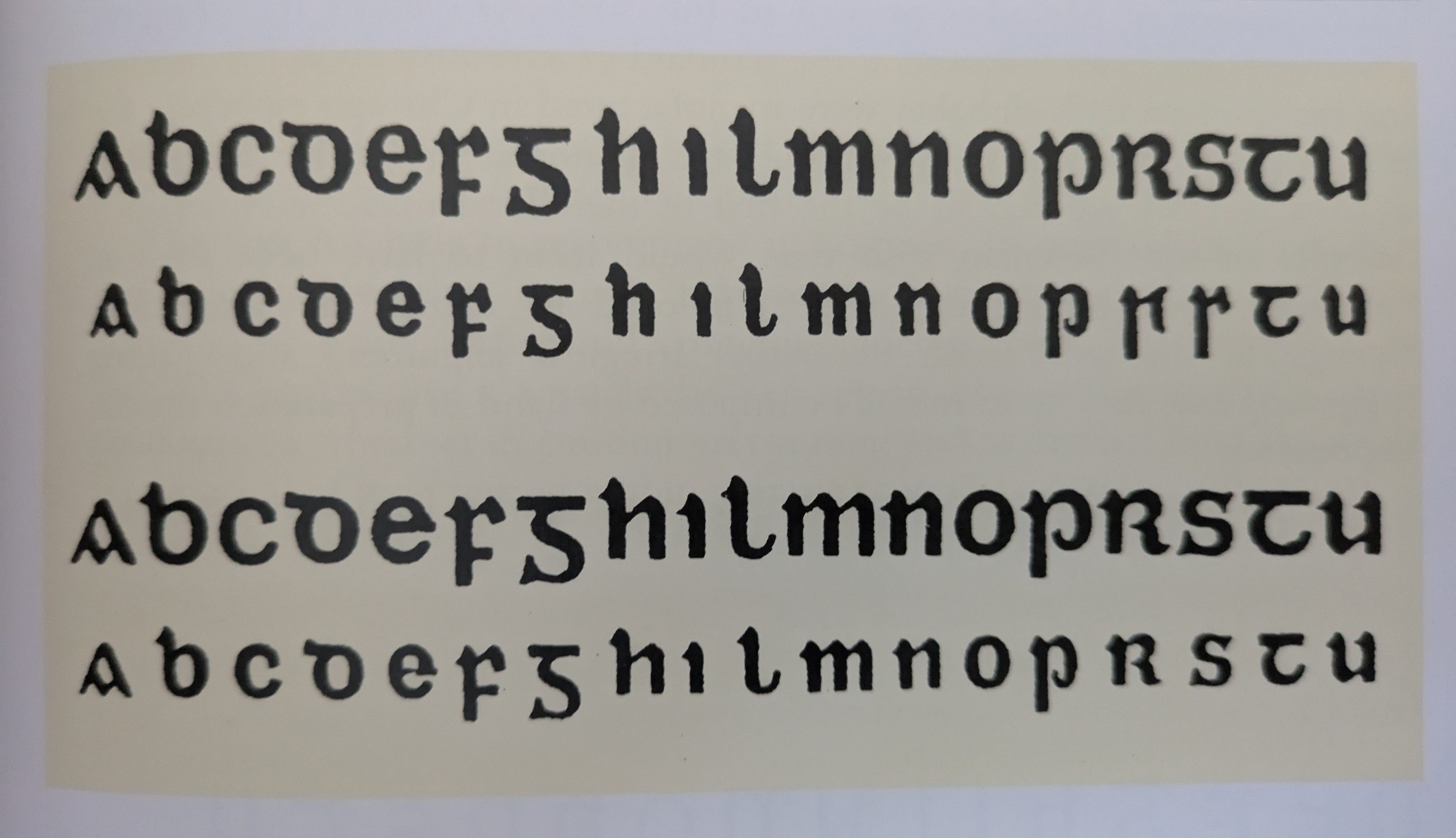
Hello, I hope you're all well. I’m laid up at the moment so I don't have many resources to hand but for a second newsletter I can offer some background on our new Segotia font. As I mentioned in the last post, it’s based on a font from 1913. I should say loosely based. Here’s the source that I used from the book Irish Type Design by Dermot McGuinne. The Top two lines are the Intertype Bold Irish Type. The bottom two lines are by Monotype.
All four lines look similar but the lower case (half uncial) of the Inter type font is more condensed.
For my first release I wanted to find a set of standard letter shapes that I could rely on as a proportional guide when drawing more elaborate fonts later. This Intertype font is quite standard, quite similar to other fonts of the time but the slightly condensed feel makes it somehow less twee to modern eyes.
The Irish font club motto is “Don't be Twee”. Obviously twee is in the eye of the beholder but Irish Font Club fonts are new fonts, for today. They are not from the old country and they are not for use in the past. A lot of Irish businesses won't go near the Irish script because they don't want to seem backwards, particularly online. It's a shame because as I said before, in modern Ireland our script is in use all over the country. It doesn't have to feel old fashioned.
I would like these fonts to be usable by businesses operating in the world today. With this font, that means: lighter, slightly condensed, more uniform widths, and less ornate in strokes and out strokes.
If anyone would like to share their thoughts, please feel free to comment (disagreements most welcome!).
Cheers
Dominic