
Scor
A modern sports font inspired by ancient Irish handwriting

The latest offering is a little different to the usual Irish Font Club releases.
Myself and Jamie from Gibney Design Co teamed up to design Scor, an Irish sports font. We are both football fans and we think Irish football could use better fonts.
The national team has worn some iconic fonts over the years but there have also been a few duds, especially when when they try to mix in old Irish characters.
Irish football goes back back and forth between using Gaelic style characters and a more modern latin script for the numbers and names on the backs of jerseys. Football is host to a clash of cultures that represents the Island pretty well. In general the modern latin characters are more typographically successful. Gaelic characters tend to work best with Gaelic words. Names like “Keane” look better when written in English simply because there is no “K” in Irish.
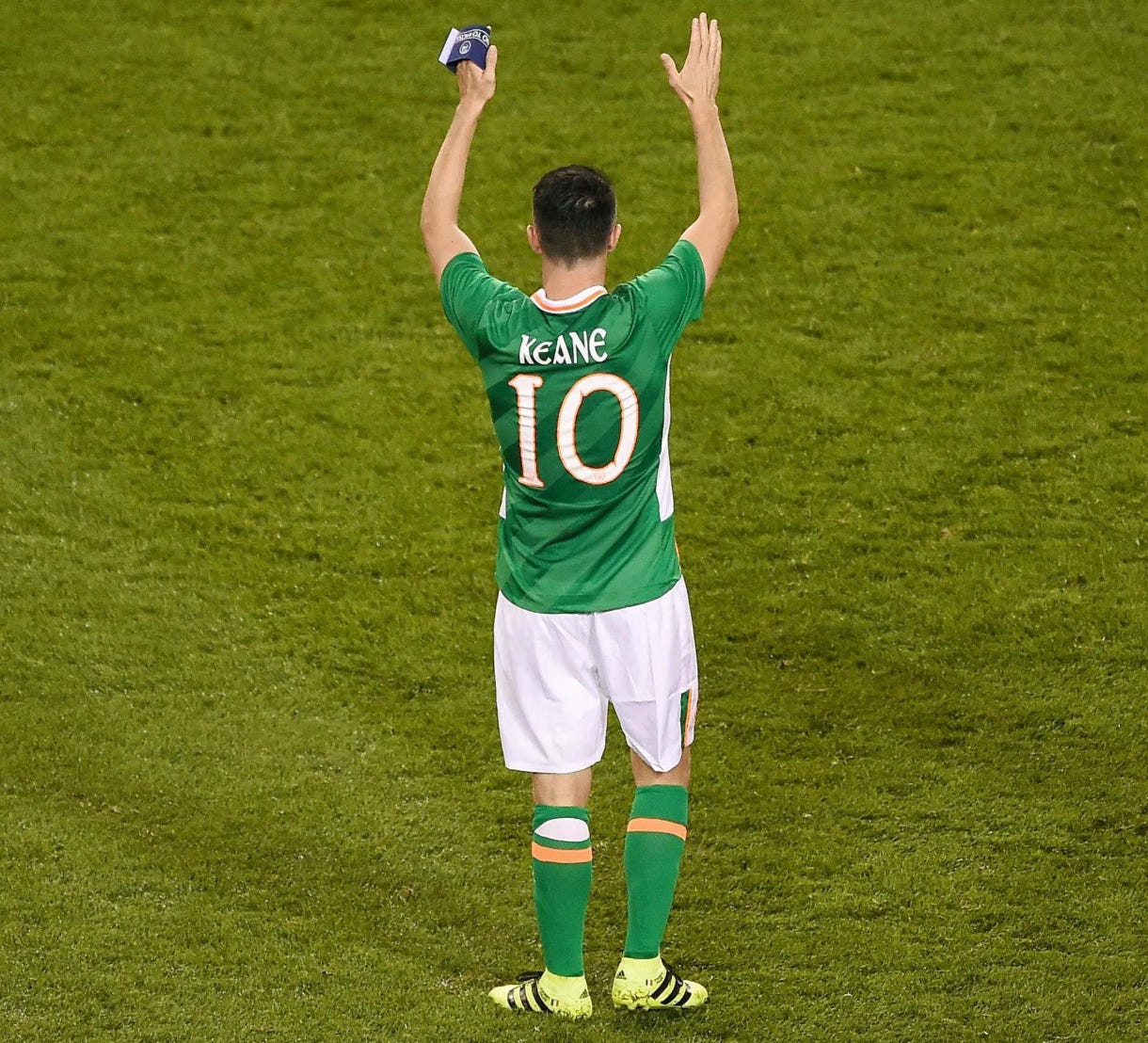
The old Gaelic characters that are employed tend to be overly ornate and they can become illegible on the backs of players who are (hopefully) on the move.
The success of a sports font should be measured by: 1, its legibility and 2, its uniqueness. Point 1 might seem obvious but designers who work with Irish football jerseys are terrible for using colour combinations that don’t contrast well - orange on green for instance. Or they’ll use Gaelic characters more suited to a full page spread in the book of Kells than on a jersey. Sports fonts often look good with inlines or outlines but an elaborate character doesn’t handle this treatment very well. I can’t find an image of them but in recent times there have been Irish jerseys with small yellow intricate Gaelic letters outlined in orange and written on green or white jerseys that were just impossible to read.
For Scor, we decided to lean more on the modern latin style and subtly introduce Irish characteristics into the font. We looked at football teams in England, Italy, France, The Netherlands and Spain and made note of what we liked and disliked. We wanted a font with lowercase characters and the iconic 2006 world cup Italian jersey stood out for us.
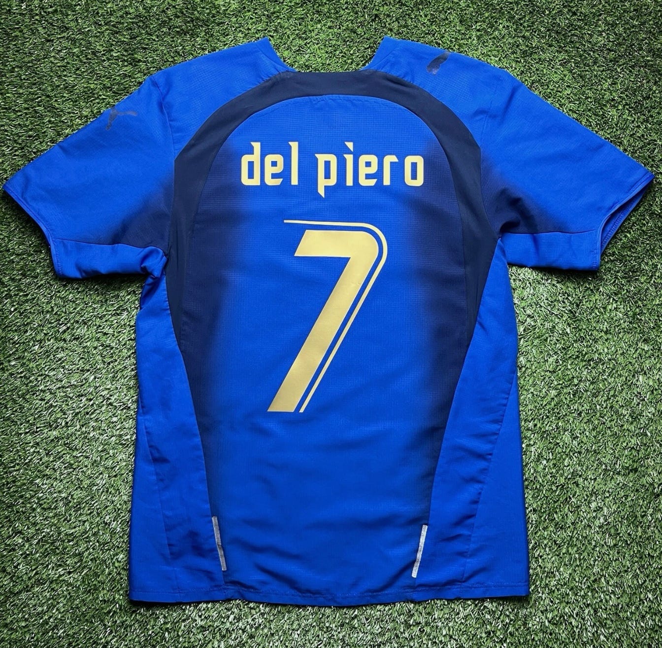
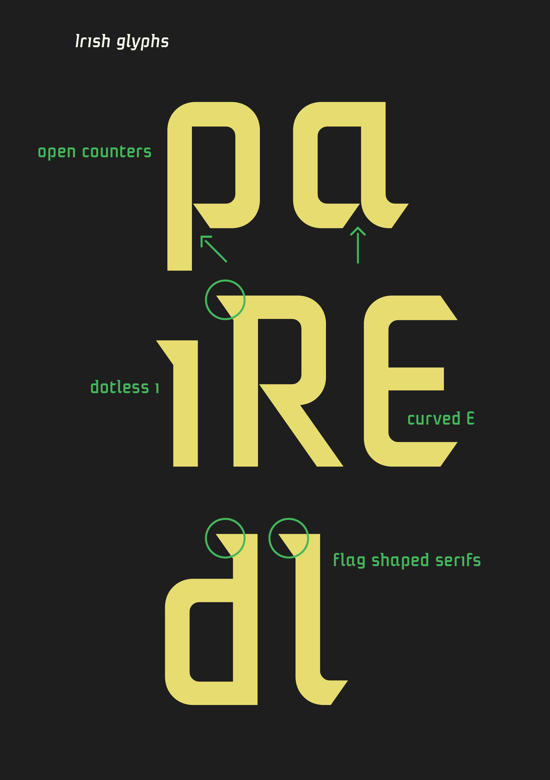
Taking some of those elements as a starting point, we designed a font with wider characters and better spacing (note the e_l above). Scor has upper and lowercase letters, italics and European diacritics for the ultimate modern Euro-style sports font. We kept the flag shaped serifs as they reminded us of the characters from Gaelic manuscripts and we also incorporated other Gaelic elements as seen here.
The result is a font that is legible and unique. It can be used all over the world but its Irishness is apparent. The number 7 is a personal favourite of mine.
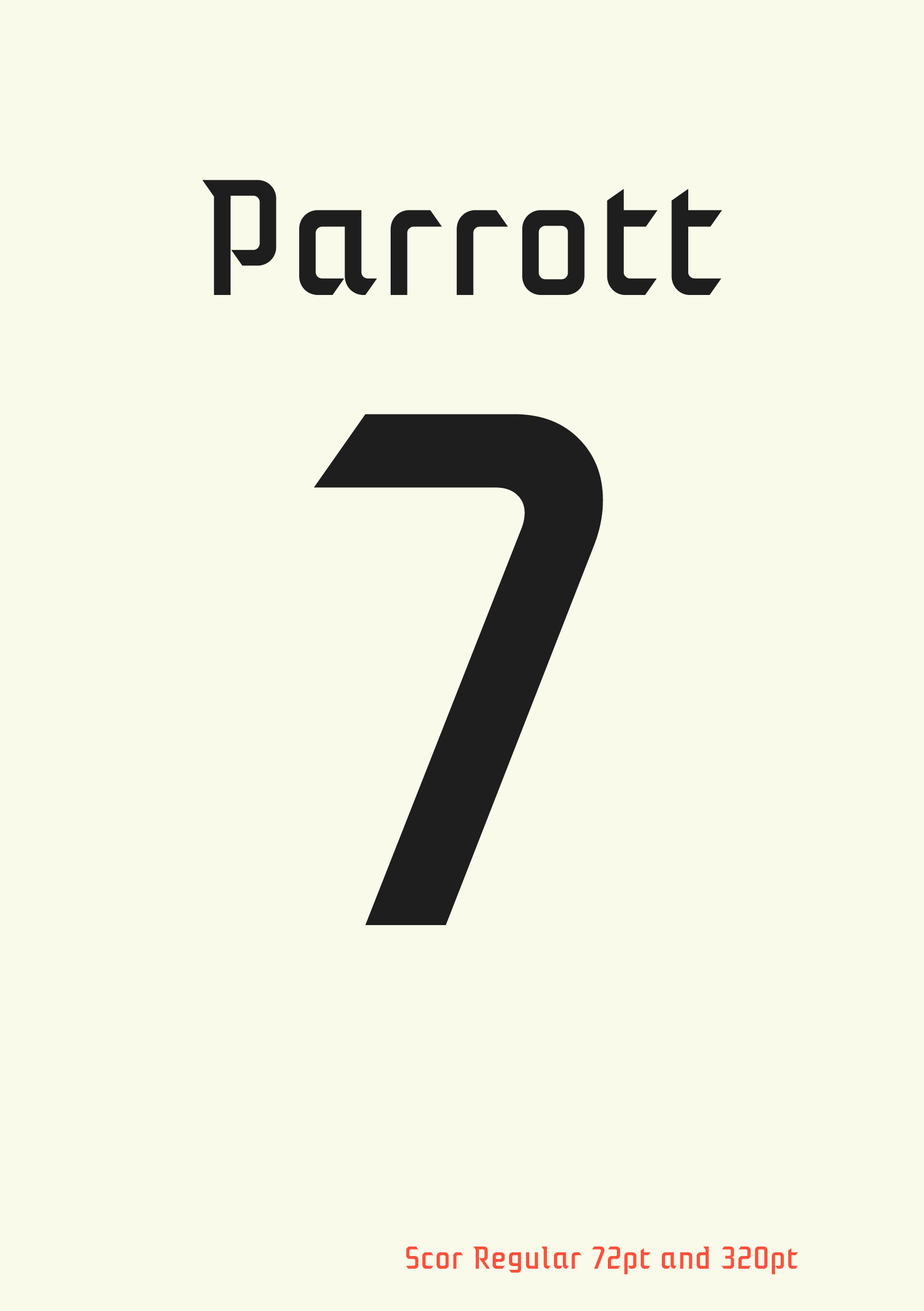
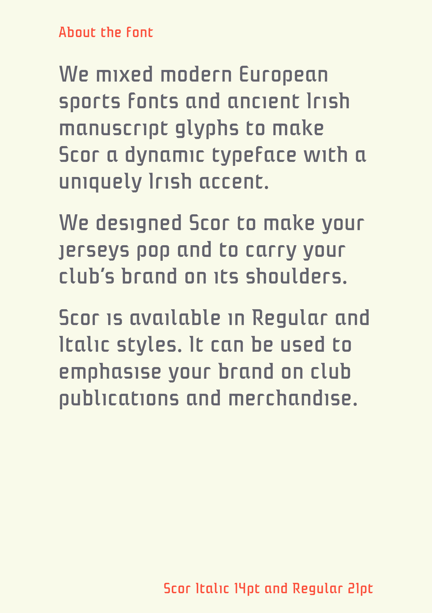
The font looks good on the backs of jerseys but we also took care to make it work in text. The serifs, cuts and open counters help to keep text light and flowing and the spacing and modularity of the characters gives a uniform texture. Its a pleasure to read and it will allow for more branding opportunities.
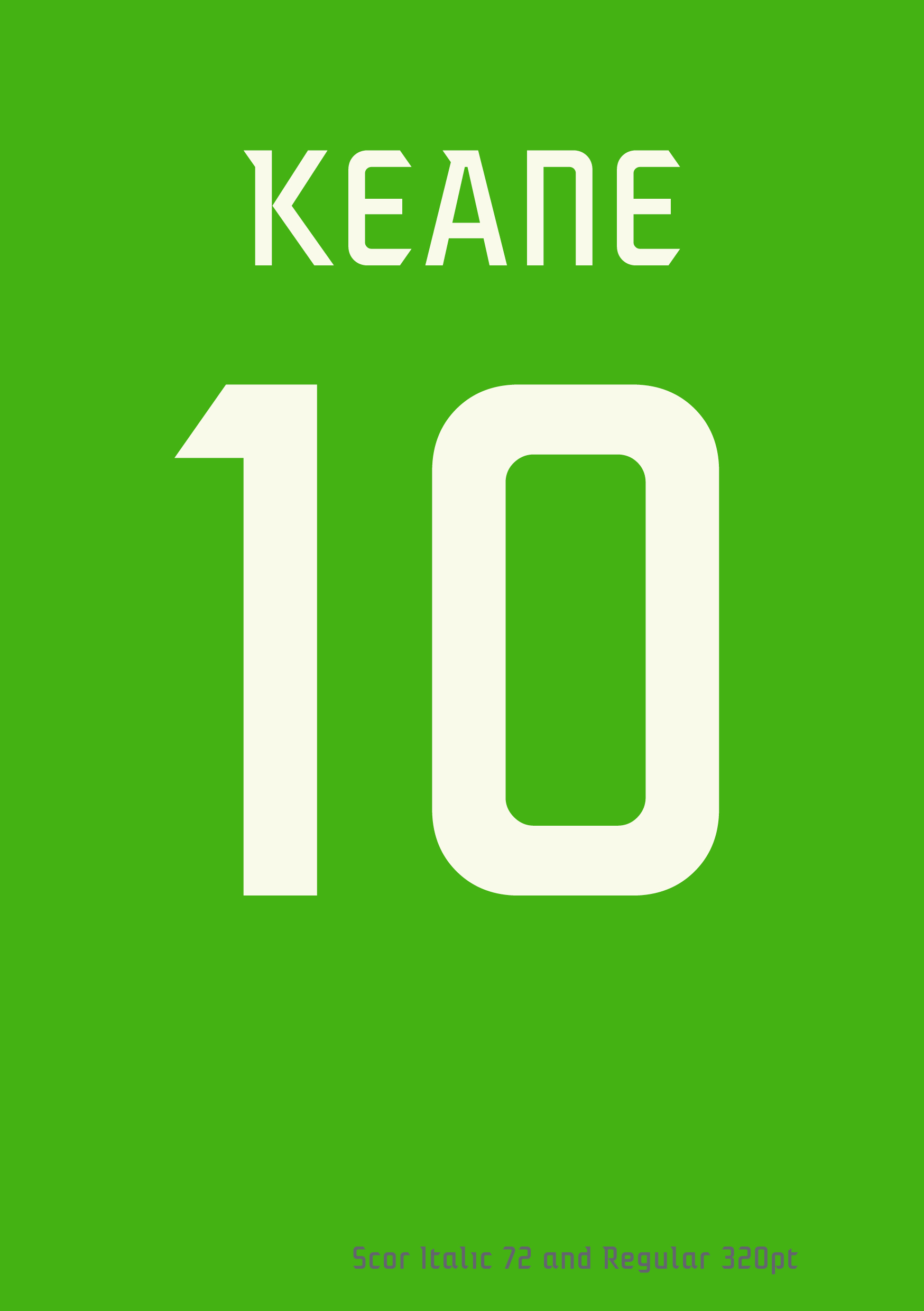
Here’s how it deals with an all caps Keane, Robbie of course.
The font is currently available for sale on Myfonts, Creative Market and Fontspring. If you would like a free sample, please get in touch with me. If your sports team ends up using Scor on their team jerseys no matter who they are; Accrington Stanley, Liverpool or even Bohs, let me know, I’d love to see it in the wild!
Cheers
Dominic
Buy Scor on Creative Market